
A huge part of your business's visual identity is your logo. Your logo is what symbolizes your brand. It brings your audience’s attention towards your business. Thus, finding the logo that is right for your business is a vital step in your marketing and promotional strategies. There is a lot that you have to go into creating your logo - one of which is deciding the best logo size to use. In this article, we will be talking about the different logo dimensions. This aims to guide you to have the right size of a logo positioned on your website and other online platforms.
Logo Dimensions
While the design of your logo is the star, take note of how it won’t make much of an impact if it is not in the best logo size that is best for the circumstances. While there are certain standard logo sizes, it generally varies depending on where you plan on putting it. Be reminded of this when creating your logo. Be careful not to use any images, symbols, or typography in your logo that would not look good in certain logo dimensions. It is best to create a logo that is customizable and adaptive, whatever logo size you publish it to. It is also important to note that your logo does not have to always be complete in itself, that is, there are instances where you should just include your logo icon (Favicon) because it is what’s appropriate.
Before we get into the specifics of what the best size of a logo is, here are some information about logos and the logo dimensions that you should know and understand:
- Logos are usually measured in pixels. The more pixels, the more details you can display, and the better its quality is. A PNG is the file format that usually best supports logos and different logo sizes because they are measured in pixels and support transparency. PNG files are also more efficient to use online since they are small in size.
- SVG Logos are a must-have. An SVG file is a kind of file that can be scaled infinitely. That is, it can be scaled to practically any logo size. SVG logos are vector logos so it is the type of logo that is not measured in pixels. The advantage of having one as your master file is that you can modify the size of your logo and print the best one for the job.
- Have different versions of your logo. While it can be tasking to create different versions of your logo, having horizontal, square, vertical, and circular variations of your logo will help you more in bringing it to the best logo size and displaying it in the best way possible. In addition, this also goes with the different colors and backgrounds that you create. Having a black and white and a transparent logo can prove to be useful in many circumstances. This will allow you to be flexible to put your logo whenever you want it to go and use it in whatever way you intend to.
- No logo size fits all. That is, you have to be reminded that with all the different platforms - both online and offline, that are existing and used in business today, you cannot expect to just have one best size for logos you would use across different platforms. It is useful to have a document or a list that will outline what the best logo size is for each of these platforms. This helps you to be consistent.
This information is meant to help you understand more about how to prepare your logos. Now, let’s move onto the main star of this article. In this next section, we will be talking about the different logo dimensions that are commonly being used. While most would consider these logos to be in the standard logo size, you would do well to remember that you have the final say about what the best logo size is for any of your business endeavors.
1. Favicon

Image taken from Strikingly Product
Favicons are the logos that are usually in the smallest logo size. And rightly so, because this is a special logo that is displayed in your website’s browser address bar - right before your website address or name. It has no text, not much design and it is most commonly published in the logo size, 16x16 pixels. However, you can also create them with the logo dimensions: 32x32 px or 48x48px. It is ideal that your favicons can really represent your brand even without much of the details that most brand logos have. Observe how the Strikingly website’s favicon is designed with the Strikingly colors and the same “S” in the typography of the Strikingly brand.
2. Social Media Platforms


Image from Strikingly User’s Website
There are many social media platforms that you can maximize the use of. You can even add a social media feed on your Strikingly website to further your connections and reach. And whether you are using your logo as your profile picture, thumbnail, or cover photo, there is an appropriate logo size to be used. As an extra tip, we encourage you to also plaster a small logo on each of your social media posts - a practice that is helpful in marketing yet is not given much attention. Finally, here are some of the logo dimensions that you should consider when using these sites:
- Instagram Profile Photo - 110x110px
- Instagram Logo on Post - 30x30px
- Facebook Profile Photo - 200x200px
- Facebook Cover Photo - 820x312px
- Facebook Logo on Post - 50x50px
- Twitter Profile Photo - 400x400px
- Twitter Cover Photo - 1500x1500px
- Twitter Logo on Post - 50x50px
- Youtube Profile Photo - 800x800px
- Youtube Thumbnail Photo - 1280x720px
- LinkedIn Profile Photo - 160x60px
- LinkedIn Cover Photo - 1128x191px
- Pinterest Profile Photo - 800x450px
3. Website Banner
For some businesses, they deem it best to have their logo as the welcome sign of their business website. This means that for them, the best logo size is the biggest one. With the website builder, Strikingly, the full-width images or logos have to be at least 1400px so that it is produced as the highest quality. Take a look at the Strikingly website below. This is a good example of a logo being used as their website banner. When you create a website with Strikingly, this is one of the best ways that you position your logo. Make sure that you follow the necessary standard logo size for it so you do not have a low-quality image banner welcoming your site visitors.


Image from Strikingly User’s Website
4. Website Headers
Strikingly also gives you more options for where to place your logo other than the position of the website banner. Depending on the template that you selected and/or the modifications you have made on your website, you can put a logo on three different sides of the header. Usually, the logo size of what you should put on your website header is at least 700px or lower. It all depends on how big you want it to be. And the Strikingly templates usually adjust the size of a logo accordingly. Thus, all you have to do is decide which logo size and logo variation would work best for the position you want to put it in.
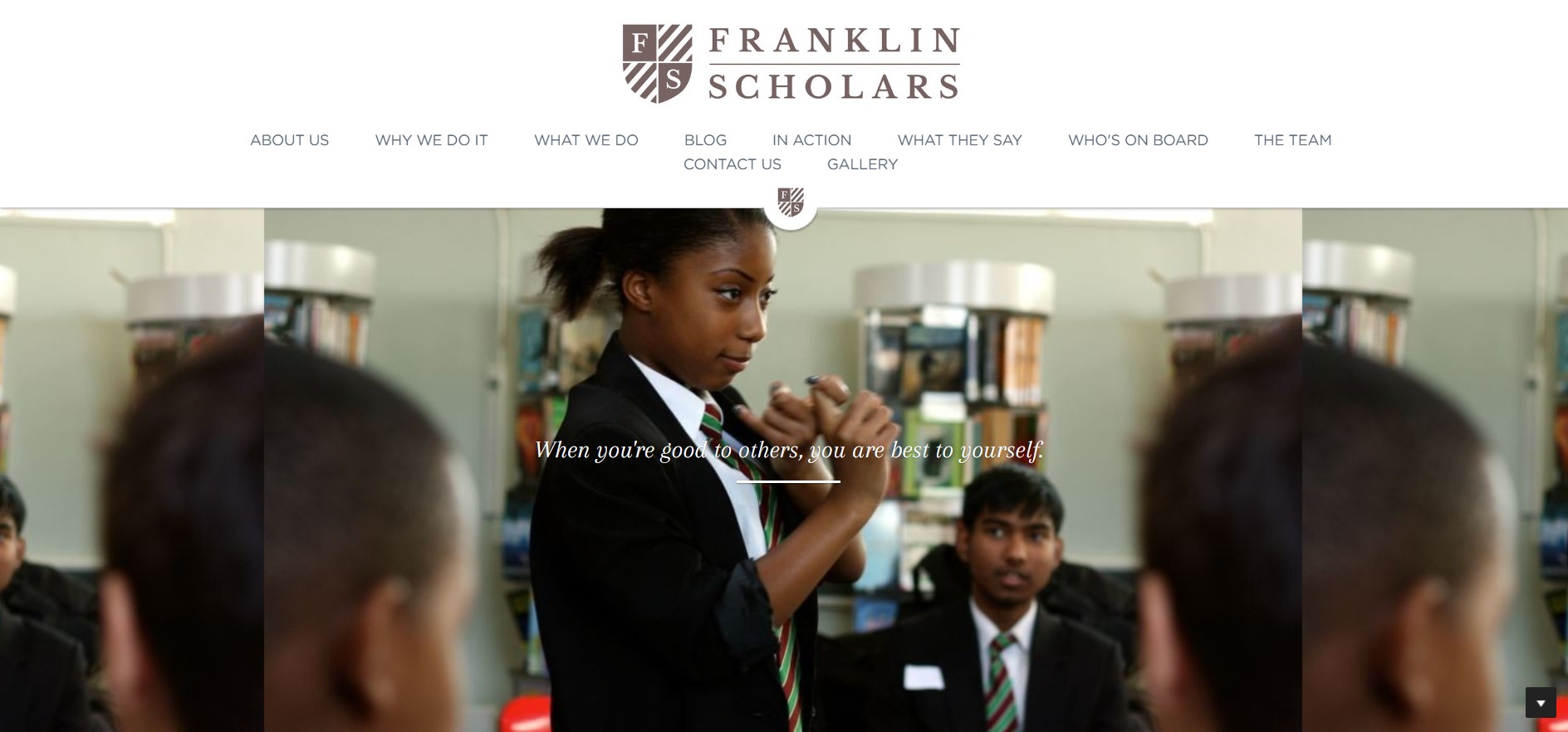
Image from Strikingly User’s Website
This first position is in the middle of your website header. This logo size is a medium one. Probably the size of a logo like this is 480px. Notice how this logo has a name and a symbol side by side. But in addition, this Strikingly website also allows you to add a small version of the logo in the middle part after the menu as well. This smaller version is best to be at least 100px wide. And it would continue to be seen as your site visitors scroll through the site.


Image from Strikingly User’s Website
Secondly, the next position of a logo is at the left side of the header. This is usually best if you have a more horizontally positioned logo, as seen in this Strikingly website above. The best logo sizes for these kinds are still similar to what was mentioned above. Be careful not to force your logo in this position if it does not look good.


Image from Strikingly User’s Website
If you want your logo to be at the left-top part of your website, you can use this Strikingly template instead. The logo size of the kind you see above is at least 360px in width or lower. With this Strikingly website template, this sidebar/header stays as is while your site visitors scroll through your website. Thus, the best logo size is that which will be visible, memorable but not too overwhelming.
Here are some other logo dimensions you should take note of:
Large Logo Sizes:
- 235x64px
- 250x150px
- 391x56px
- 350x75px
- 400x100px
- 1280x720px
- 1024x1024px
Medium Logo Sizes:
- 109x64px
- 120x61.8px
- 160x160px
- 190x60px
- 300x75px
- 1000x200px
Small Logo Sizes
- 40x40px
- 76x76px
- 80x24px
The best logo size to be used varies from business to business. Remember that while it is totally normal and helpful to find inspiration from other websites and successful brands, at the end of the day, it is up to you to decide which logo size is best for you, your business, and your website. Be strategic yet creative. Ensure that your logo is seen and that it is of high quality. There are a lot of tips and tricks about creating the logo that you use as a guide in addition to this one. It is helpful to include and insert your logos anywhere, as much as you can, but be careful not to overdo it. Customers tend to get tired and irritated when they see too much of anything. Thus, you have to be really smart in how you size and position your logo on your website. Sign up now and let Strikingly help you design your website and give you the power to bring your logo to the best logo size it can be.
