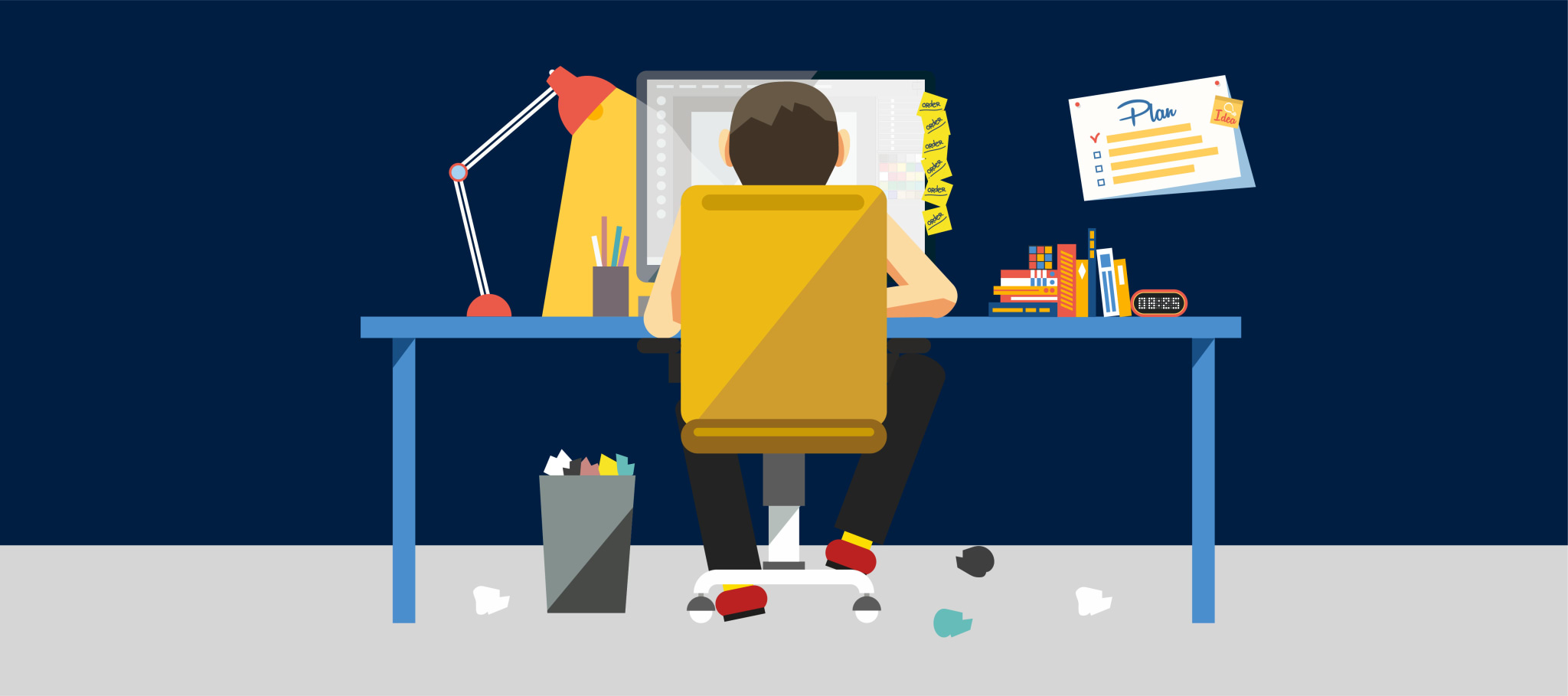
Are you looking for a hobby that you can enjoy from your home? How about making money out of that hobby at the same time? If interested, you can build the best website design for your blogging platform.
Blogging is considered one of the most extensive trending fields in which entrepreneurs are engaged. As a result, many individuals and companies have established the best blog designs and used them to share their thoughts in the online community.
There are thousands of blog design examples that you can surf on the Internet for inspiration. You can make notes from those examples depending on your niche and build the best blog design for yourself or your company. With the best website design choice for your blog, your readers can easily connect with you.
Your blog design is the opening gate of your business blog, just like your website's homepage is the opening gate of your firm.
Tips to Develop a Beautiful Blog Design
1) Minimize Your Blog’s Page Bloat
According to the information shared by Web Performance Today, the average size of a webpage is 1246 kb, and it looks like it will stay the same for a while. However, more extensive web pages are problematic for website owners and users despite the increasing trend because they give slower performances and higher bandwidth costs.
According to the stats shared by Kissmetrics, 40% of visitors leave the website if it loads in at least three seconds. Performance indicators are an issue, especially for mobile users, because larger websites usually take more than three seconds to load successfully.


Image taken from Strikingly
One of the common reasons for slow website performance is the large-sized images. When low-bandwidth devices access your website, your images, having resolutions of a desktop version, will load slowly and eventually increase your bandwidth costs. You can find several tools on the Internet, such as Adaptive Images, which will visualize the screen size of your visitors and provide a modified version of your website images. In addition, you can adjust the script to set the browser caching and image quality.
If you are an experienced programmer, you can check out your JavaScript or CSS code to remove any unnecessary line breaks. Make sure that you identify the elements that are added unnecessarily. For example, you may have your social media feed on every webpage.
2) Make Relevant Content
The best blog designs aren't just attractive based on their look and content quality. For example, visitors will click on your blog design website because they found it in their search engine results. After landing on your website, they will notice you wrote the content years earlier. They will eventually leave your website if they feel your information is outdated. When you write blogs, make sure you write them in a way that they look relevant in years to come. Most importantly, it would be best to write your blogs in a way that they look exciting and factual after a few years.


Image taken from Strikingly User’s Website
If you find anything outdated on your blog website, take your time to make it relevant again. For example, if you wrote a blog several years ago, identify any new statistic or fact you can add to that blog. Then, you can review your archive once every month to see what you can update on your blog website.
3) Simplify Navigation
Let's assume that your visitors need to see your blogs from a specific date or start from a specific letter. Would they know what to do after landing on your blog website? Will your readers be able to differentiate between your more crucial static web pages and your blog posts? The best blog designs always have website navigation on the top or left side of their homepage and blog section. The navigation elements guide the readers to find their desired blog. At the very least, your website navigation should contain the following components:
- Menu
- Search bar
- About page
- Contact page
- Archive page


Image taken from Strikingly User’s Website
When people click on these components, they come to expect certain things. For example, your website logo should be clickable and bring them back to the website's homepage. This identity is essential for those visitors who need your website in their search history. It can also benefit those visitors who have been searching your website for some time. You don't have to press your browser's back button to return to your website homepage.
4) Display Best Content
Certain webpages attracting a lot of website traffic means that those pages have content that your readers can relate with. As a website owner, you must make it easy for your visitors to locate and advertise the content. For example, if the new visitor has landed on your blog design website, they will likely stay on your website for a little longer if they see links to other attractive content.
As the most popular web pages will interest them, you should promote and advertise them on all of your web pages. The best way of doing that is by including it in your navigation menu or displaying it at the bottom of your webpage.
5) Make Attractive Content
Over the years, readers have become selective with the web pages they prefer to read. As a website owner, you must note that more than having high-quality content is needed. The best blog designs also take care of the content's presentation. Making engaging and compelling content will make it stand out from the rest of your published blogs.
If we go by the basic level, your content should be easy to read. It would help if you didn't contain lengthy paragraphs that your audience simply refuses to read. If you look at the beautiful blogs worldwide, they go with the policy of one idea per paragraph. You can go through the following tips to improve your readability status:
- Subdivide your content into sections
- Add photographs relevant to your topic
- Insert charts, diagrams, and infographics to support your data or statistics
- Add a bullet list
Once you are done with the content structuring, you must ensure that it perfectly blends with your website design. For example, is the text easy to read on your blog design? You can use white space to support your text and remove unnecessary widgets from your homepage.
6) Make a Mobile-Friendly Blog Design
More and more people are browsing the Internet through their mobiles. Therefore, many entrepreneurs and companies have adapted their websites accordingly.
If you are a blogger, mobile-friendly blog designs aren't just a trend but a necessity. If your website is only specified for the desktop version, expect your visitors to stick around your website for a short time.
If your websites are mobile-friendly, viewers will find it easier to navigate through your website. However, they must zoom into your text to read it then and adequately constantly scroll to continue reading. Therefore, they may need help zooming in or clicking the wrong link.
Strikingly is a website builder that provides its users with responsive website templates that can be accessed by mobile and desktop users.
Create a Blog Design on Strikingly
Strikingly is a startup website builder that has delighted global users with its intuitive web services and simple blog features. It helps bloggers to be more creative and build the best website design for their platforms.


Image taken from Strikingly
Once registered on our platform, we will provide you with a collection of themes and templates. We offer our users a variety of attractive blog designs, which you can customize to express yourself or your blog freely. If you want to develop an exquisite blog design homepage, you must tick the following characteristics:
- Catch your visitor's attention in the first instance
- Introduces what your website and your blogs are about
- Encourages your visitors to scroll through the entire webpage
Once you finish the blog design, you can shift your focus to the website logo. Ensure your logo is unique and attractive to add to your brand personality. Once you have built your logo, you can add it as your website's favicon.


Image taken from Strikingly
Strikingly's navigation options are amongst the best in the eCommerce world. As the website owner, you can display them the way you want without any coding or programming skills. However, we recommend you put your navigation elements on the left side of the homepage because readers go through the website from left to right.
Conclusion
With just a few resources at your disposal, you will make your company blog as exquisite as your competitors. But, of course, your blog design must be something other than a clone. So instead, make notes of the aspects you have enjoyed from the successful blog designs and find a way to incorporate them in your blog design. With this approach, you can make a beautiful blog design unmatched.
Starting your blog could be an overwhelming task for beginners. However, if you want to explore the blogging world, you would welcome challenges with open arms. Feel free to experiment and try new things to make your blog design attractive.
You can pick the right partner to influence people with your blogs if you have adequate financial resources. However, if you still need clarification about choosing the best blog design for your website, chat with our Happiness Officers today at Strikingly, and we will kickstart your blogging journey.


