Mobile-Friendly Website Navigation: Optimizing for Small Screens
Mobile-Friendly Website Navigation: Optimizing for Small Screens

Effective website navigation is more crucial than ever in today's digital world, especially for mobile users. With significant web traffic from smartphones and tablets, ensuring your site is mobile-friendly can make or break the user experience. This guide will explore how to design intuitive website navigation that caters to the needs of mobile users while avoiding common website navigation mistakes.
Importance of Mobile-Friendly Navigation
Mobile-friendly website navigation enhances user engagement by allowing visitors to find what they need quickly and easily. A seamless navigation experience can lead to longer visit durations and increased conversions, as users are less likely to abandon a site due to frustration with its layout. Furthermore, search engines prioritize mobile-optimized websites in their rankings, making effective website navigation essential for visibility.
Understanding User Behavior on Small Screens
User behavior on small screens varies significantly from desktop usage; people tend to scroll more and prefer quick access to information. Users often have limited patience for complicated menus or lengthy loading times on mobile devices, underscoring the need for streamlined website navigation. By understanding these behaviors, designers can create experiences that cater specifically to the unique challenges posed by smaller displays.
Key Elements of Effective Website Navigation
Effective website navigation incorporates several key elements that enhance usability across devices. First and foremost is simplicity; a clean layout with clear pathways helps users find their way without confusion. Additionally, utilizing breadcrumbs in website navigation not only aids in orientation but also provides context about where users are within the site's structure—making it easier for them to backtrack if needed.
How to Design Intuitive Website Navigation

Zine Template
Designing intuitive website navigation is crucial for enhancing user experience and keeping visitors engaged. When users can easily find what they’re looking for, they are more likely to stay on your site longer and return in the future. This section will explore key strategies to create effective website navigation that avoids common pitfalls.
Simplifying Menu Structures
One of the best ways to improve website navigation is by simplifying menu structures. A cluttered menu can overwhelm users, making it difficult for them to locate essential information quickly. By limiting the number of items in your main menu and grouping related links, you create a cleaner layout that guides users effortlessly through your site.
Consider using a hierarchical approach where primary categories are clearly defined, with subcategories underneath them. This not only declutters your navigation but also helps visitors understand the relationship between different website sections. Remember, simplicity is key; aim to balance providing enough options without overwhelming the user.
Prioritizing Essential Links
When designing intuitive website navigation, it's vital to prioritize essential links based on user needs and behaviors. Conduct research or analyze existing data to identify which pages are most frequently visited or valuable for your audience. Placing these critical links prominently in your navigation menu ensures that users can access important content with minimal effort.
In addition to prioritizing links based on popularity, consider organizing them according to their relevance or importance within user journeys. This approach helps guide users toward their goals more efficiently while minimizing frustration often caused by navigating through unnecessary options. Prioritization not only improves user satisfaction but also enhances overall site performance.
Utilizing Clear Labels
Clear labels are essential in effective website navigation as they provide immediate context about what each link leads to. Avoid using jargon or overly clever names that may confuse users; instead, opt for straightforward language that accurately describes the content behind each link. This clarity helps reduce cognitive load and allows visitors to navigate confidently without second-guessing their choices.
Additionally, consider employing consistent terminology throughout all navigational elements across your site so that users develop familiarity as they explore different sections. Consistency builds trust and makes it easier for visitors to anticipate where certain information might be located based on previous experiences with your website navigation structure. Remember: clear labels enhance usability and contribute significantly to an intuitive design.
Common Website Navigation Mistakes

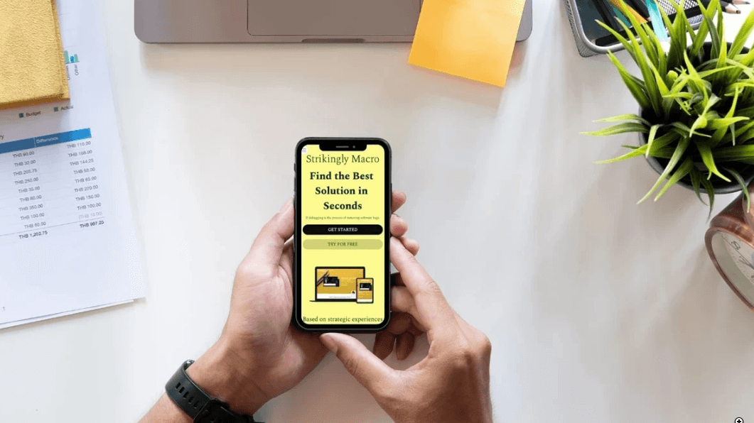
Macro Template on Mobile
Even small mistakes can lead to a frustrating user experience regarding website navigation. Understanding standard website navigation mistakes is essential for creating an intuitive site that engages users. Let’s dive into some of the most prevalent pitfalls and how to avoid them.
Cluttered Designs to Avoid
One of the biggest mistakes in website navigation is cluttered designs that overwhelm users with too much information at once. A cluttered navigation bar can confuse visitors, challenging finding what they’re looking for. Instead, focus on a clean layout that prioritizes essential links and uses whitespace effectively, enhancing the overall user experience and streamlining your website navigation.
Another aspect of cluttered designs is the tendency to cram too many items into dropdown menus or sidebars. This can lead to decision fatigue, where users feel overwhelmed by choices and may abandon your site altogether. To create intuitive website navigation, aim for simplicity—limit the number of items displayed at any time and categorize content logically.
Lastly, remember that mobile users are susceptible to clutter since their screens are smaller. By avoiding overly complex or busy designs, you ensure your website remains accessible and user-friendly across all devices, reinforcing the importance of breadcrumbs in website navigation as a wayfinding tool.
Overcomplicated Dropdowns
Overcomplicated dropdowns can be another significant issue in website navigation design. While dropdown menus can help organize content efficiently, making them too intricate often results in confusion rather than clarity. Users should be able to navigate through categories without feeling lost quickly; therefore, limiting subcategories and ensuring they are logically organized is crucial.
Additionally, consider how dropdowns behave on mobile devices where hover actions aren’t possible. Suppose your dropdown menus rely heavily on hover effects. In that case, mobile users may struggle to access essential links or features entirely—leading them away from your site instead of deeper into it. Simplifying these menus for touch interactions will significantly improve user experience across all platforms.
Lastly, always test your dropdown functionality using tools to test website navigation before going live with changes. This will allow you to identify potential issues early on and refine your approach based on honest user feedback.
Ignoring Mobile Usability
In today’s digital landscape, ignoring mobile usability is a critical mistake when designing website navigation systems. With more people accessing websites via smartphones than ever, ensuring seamless mobile experiences should be a priority rather than an afterthought. You risk alienating many potential visitors if your site isn’t optimized for mobile use—whether through responsive design or dedicated mobile interfaces.
Moreover, many traditional desktop navigational elements don't translate well onto smaller screens, including extensive menus or intricate layouts that work fine on desktops but become cumbersome on phones or tablets. Prioritizing straightforward designs tailored specifically for mobile use will enhance usability and keep visitors engaged longer—a win-win situation!
Finally, regular testing using various tools for testing website navigation can help you identify areas where improvements are needed, explicitly concerning mobile usability features like tap targets and scrolling behavior. By staying proactive about these design and implementation aspects, you’ll create an inviting atmosphere conducive to exploration, regardless of device type.
Importance of Breadcrumbs in Website Navigation

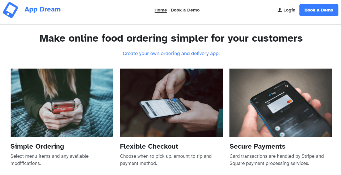
App Dream Template
Breadcrumbs are a powerful tool in website navigation, providing users with a clear path to previous pages. They enhance the overall user experience by reducing the number of clicks needed to navigate back through a site. By incorporating breadcrumbs, designers can create intuitive website navigation that helps users understand their location within the site hierarchy.
Enhancing User Experience
Users who engage with a website appreciate features that simplify their journey. Breadcrumbs enhance the user experience by offering context and clarity about where they are within the site's structure. This is especially important for websites with extensive content or multiple categories, as visitors can retrace their steps without feeling lost.
Adding breadcrumbs can also improve accessibility for all users, including those on mobile devices who may find scrolling tedious. They provide an easy way to navigate without relying solely on back buttons or complex menus. Effective website navigation that includes breadcrumbs ultimately fosters user satisfaction and encourages more extended visits.
Implementing Breadcrumbs Effectively
To implement breadcrumbs effectively, choosing the right type for your website's structure is crucial—whether hierarchical, attribute-based, or history-based. The design should be simple and unobtrusive to complement rather than overwhelm other elements of your site's navigation framework. Clear labeling is essential; each breadcrumb link should indicate its corresponding page accurately to guide users seamlessly.
Positioning is another critical factor; placing breadcrumbs near the top of the page allows them to be easily spotted without cluttering up valuable screen real estate. Additionally, ensure that your breadcrumbs are clickable links so users can navigate effortlessly between sections without confusion or frustration—a common mistake in website navigation design that can lead to high bounce rates.
Examples of Successful Implementations
Many successful websites utilize breadcrumbs effectively as part of their overall design strategy for intuitive website navigation. For instance, e-commerce sites like Amazon incorporate breadcrumbs prominently on product pages; this helps shoppers locate similar items and enhances their ability to explore related categories easily. Similarly, news websites like CNN use breadcrumb trails on article pages so readers can trace back through topics and sections effortlessly.
Another excellent example is Wikipedia, where breadcrumb navigation provides clear pathways through its extensive content library while maintaining simplicity and accessibility across devices—addressing common website navigation mistakes seen elsewhere online. These examples illustrate how well-implemented breadcrumbs contribute significantly to user experience by ensuring seamless transitions between site sections.
Tools for Testing Website Navigation

Strikingly Contact Form
Utilizing the right tools can make a difference when refining your website navigation. These tools help you assess how users interact with your site, identify pain points, and ensure your navigation is as intuitive as possible. By focusing on effective website navigation testing, you can enhance user experience and avoid common website navigation mistakes.
Overview of Popular Testing Tools
There are several popular tools available that can assist in testing website navigation. Google Analytics is a staple for tracking user behavior, allowing you to see which links are clicked most frequently and where users drop off. Other tools like Hotjar provide heatmaps and session recordings to visualize how visitors navigate your site, giving insights into the effectiveness of your design elements.
Additionally, usability testing platforms like UserTesting or Lookback enable real-time feedback from users interacting with your site. These platforms allow you to observe how users navigate various sections, helping identify areas where improvements are needed. Using these testing tools will empower you to understand better how to design intuitive website navigation tailored to your audience's needs.
Analyzing User Feedback and Behavior
Once you've gathered data using testing tools, the next step is analyzing user feedback and behavior effectively. Pay close attention to patterns in user interactions; this includes understanding which visitors prioritize essential links and if they struggle with any dropdowns or menu items. This analysis helps pinpoint standard website navigation mistakes that may hinder the overall experience.
User feedback can also be collected through surveys or direct interviews after usability tests, providing qualitative insights into their experiences navigating your site. Combining quantitative data from analytics with qualitative insights creates a comprehensive picture of how users perceive your website navigation. This understanding will guide you in making informed adjustments that enhance usability while ensuring that essential links remain easily accessible.
Optimizing Based on Testing Results
After analyzing user behavior and feedback, it's time to optimize based on the results you've gathered from testing tools. Start by addressing any identified issues related to cluttered designs or overcomplicated dropdowns that may confuse users navigating through your site. Implementing clear labels for menu items will also aid in avoiding common pitfalls associated with poor website navigation.
Regularly revisiting these optimizations ensures that you're staying ahead of trends in mobile usability and evolving user expectations regarding ease of access and simplicity in design elements like breadcrumbs in website navigation. Optimization is ongoing; new designs or features are regularly tested based on user behavior trends to improve their experience. Ultimately, optimizing based on solid testing results leads to better website navigation and increased visitor satisfaction.
Strikingly Features for Optimizing Navigation

Strikingly Landing Page
When it comes to optimizing website navigation, Strikingly offers a range of features that make the process seamless and user-friendly. With a focus on simplicity and effectiveness, these tools can help you avoid common website navigation mistakes while enhancing the overall user experience. Let's dive into some standout features that can elevate your website's navigation.
Utilizing Templates for Simplicity
Strikingly provides a variety of templates designed with intuitive website navigation in mind. These templates simplify the setup process by offering pre-structured menus that prioritize essential links, making it easier for users to find what they need quickly. Utilizing these templates can avoid cluttered designs and ensure your site remains clean and navigable.
In today's mobile-first world, having a mobile-friendly website is essential for reaching your target audience. A well-organized and easy-to-navigate mobile website can significantly improve user experience and boost conversions. Strikingly's responsive templates make it easy to create mobile-friendly websites that look great and perform seamlessly on all devices.
Why Mobile-Friendly Navigation Matters?
- Enhanced User Experience. A clear and intuitive mobile navigation experience keeps visitors engaged and encourages them to explore your website.
- Improved Conversion Rates. A well-organized mobile website can lead to higher conversion rates by making it easier for users to find what they're looking for.
- Better Search Engine Rankings. Mobile-friendliness is a key factor in Google's search algorithm. A mobile-optimized website can improve your search engine rankings.
How Strikingly Can Help
- Choose a Responsive Template. Strikingly offers a wide range of responsive templates that automatically adjust to different screen sizes.
- Simplify Your Menu. Keep your mobile menu concise and easy to navigate. Use clear and concise labels for your menu items.
- Prioritize Important Content. Focus on the most important content for your mobile visitors. Consider using a hamburger menu to hide less important information.
- Optimize Your Images. Compress your images to reduce page load times and improve mobile performance.
- Test Your Mobile Website. Use Strikingly's built-in testing tools to ensure your website looks and functions correctly on all devices.
Step-by-Step Guide to Creating a Mobile-Friendly Website with Strikingly
- Sign Up for a Strikingly Account. Create a free account to get started.
- Choose a Responsive Template. Select a template that is optimized for mobile devices.
- Customize Your Website. Use Strikingly's drag-and-drop editor to personalize your website's design and content.
- Simplify Your Menu. Keep your mobile menu concise and easy to navigate.
- Prioritize Important Content. Focus on the most important content for your mobile visitors.
- Optimize Your Images. Compress your images to improve page load speed.
- Test Your Mobile Website. Use Strikingly's built-in testing tools to ensure your website looks and functions correctly on all devices.
By following these steps and leveraging Strikingly's powerful tools, you can create a mobile-friendly website that provides a seamless user experience and drives conversions.
Mobile Preview Functionality
One of the most critical aspects of modern web design is ensuring mobile usability, where Strikingly’s mobile preview functionality shines. This feature lets you see how your website navigation will appear on various screen sizes before publishing it live. Testing different layouts and structures in real time allows you to identify potential issues related to standard website navigation mistakes.
Mobile preview helps highlight areas where adjustments may be necessary, especially regarding dropdown menus or links that might not translate well on smaller screens. Understanding user behavior on small screens is vital; this tool empowers you to make informed decisions about optimizing your site for mobile visitors. Ensuring seamless navigation across devices enhances user experience significantly.
Built-in Navigation Customization Options
Strikingly also offers built-in navigation customization options that allow you to tailor your site's menu structure according to your specific needs. Whether you're looking to prioritize certain links or create unique categories, these options give you the flexibility required for effective website navigation design. You can easily adjust labels and positions without needing extensive coding knowledge.
These customization tools enable you to implement breadcrumbs effectively—an often-overlooked element in enhancing user experience within website navigation systems. Breadcrumbs provide context and help users retrace their steps easily; this is crucial when designing intuitive website navigation paths that keep visitors engaged longer on your site. Regular updates based on analytics from tools for testing website navigation further refine these customizations over time.
Stay Ahead with Mobile Trends

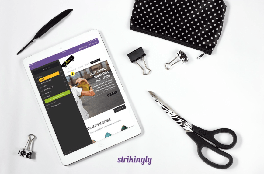
Strikingly Editor on Mobile
Creating seamless navigation experiences is essential for retaining users and enhancing their overall satisfaction in the ever-evolving digital landscape. Effective website navigation guides visitors through your content and encourages them to engage with your site more deeply. By focusing on intuitive design principles, you can ensure that users find what they need quickly and easily, leading to a more enjoyable browsing experience.
Creating Seamless Navigation Experiences
When designing intuitive website navigation, it's crucial to prioritize clarity and simplicity. Users should be able to navigate your site without confusion or frustration; this means avoiding cluttered designs and overcomplicated dropdown menus that can lead to common website navigation mistakes. Additionally, incorporating elements like breadcrumbs can enhance the user experience by providing clear pathways through the site's hierarchy.
Regularly Testing and Updating Navigation
Regular testing is vital to maintaining effective website navigation. Utilizing tools for testing website navigation allows you to gather valuable insights into user behavior and preferences, helping you identify areas for improvement. By continuously analyzing feedback and making necessary updates, you can refine your navigation structure and keep it aligned with user expectations.
Staying ahead with mobile trends is essential in today’s digital world, where many users access websites via smartphones or tablets. This means understanding the importance of breadcrumbs in website navigation as they offer a quick way for users to retrace their steps on smaller screens. By keeping abreast of emerging trends and regularly updating your site’s features based on user feedback, you can ensure that your website remains relevant and easy to navigate.
