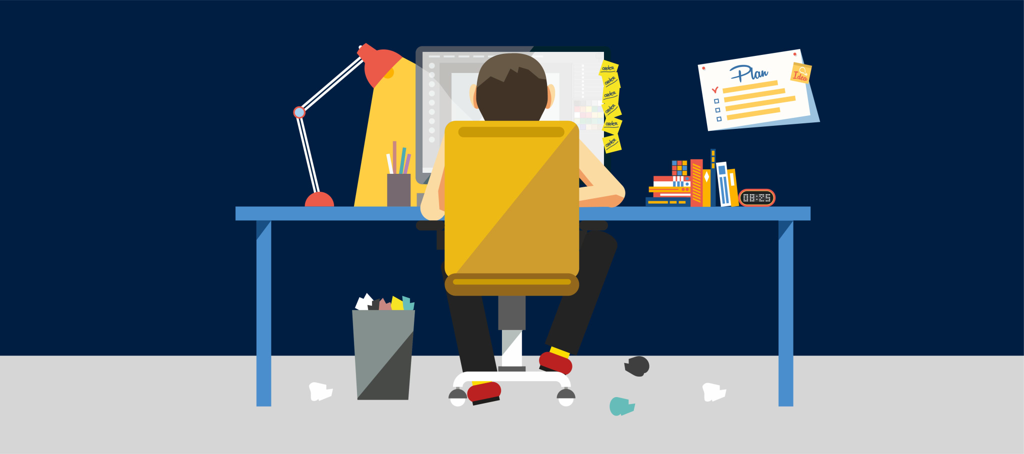
Blogger sites have become the cornerstone of a successful content marketing campaign. If you’re looking to build a new site to house your growing blog, here are a few of the best design inspirations to get you started.
Wistia

If there is one thing that you should keep in mind when building blogger sites, it is readability. You are creating a page for human consumption so you want to make it easy for your visitors to read and understand your content.
Wistia’s blog creates a positive user experience by giving the visitor all the information he or she needs to assess if the post is relevant to him or her. This includes a clear headline, a short excerpt from the article and a category.
Speaking of categories, Wistia also keeps it more streamlined by limiting the number of topic categories to four major ones - another thing that you want to implement on your posts. Try to group your content into as few categories as possible to simplify navigation.
Sigstr


Sigstr’s blog features another good example of making your page readable and easy to navigate. The card style layout is a common favorite among blogs because it makes the content easier to digest. While you’ll normally see a three-column layout in many blogs, this site starts with a two-column layout for its most recent posts to limit the conflicting messages the user gets.
Implement this tile format on your Strikingly blog by using the Byte Sized website template. This enables you to list your latest blog posts along with accompanying featured image, headline and short excerpt for a quick and efficient content preview.
Pretty Olive Interiors


Pretty Olive Interiors shows you how you can convert business sites into blogger websites by simply incorporating a section seamlessly into your template. The Simple Blog section on this Strikingly powered website goes well with the site. The card layout contains the necessary information that the user will want to see to evaluate the relevance of a post. The section also limits the featured posts to the top 3 most recent articles so the user gets served with fresh content every time he comes back to visit the site.
Truf


Blogger websites need to be engaging and user friendly. The design should invite the visitor to stop and read the posts without feeling too overwhelmed by the volume of text content. Truf Creative’s blog website features beautiful and huge images arranged in asymmetrical grid style layout. When you hover over each image, you’ll see the post title and the category where it is classified to give you a better sense of what the article is about.
The website stays true to the business website’s color scheme, making the blog site another branding platform for the company. This is another detail that you should think about when creating blog websites separate from your business site. You want to use the same color schemes so users will be able to associate your blog with your brand easily.
Sprout Social


Sprout Social deviates from the usual grid style card layout for listing blog articles by going full-width on the blog cards instead. Each entry is as informative as one can get with such a huge real estate per card - a descriptive headline, content excerpt and a call to action that gets the user to continue reading in the actual blog article’s page. This is a suitable layout if you use interesting visuals in every blog article and is appropriate for users who are always in a hurry. A quick scroll through the list will give you a good idea on which articles are worth reading. The longer content excerpt already gives you a good head start on reading the blogpost.


